
NutriBalance is a nutritional coaching and calorie tracking app that serves as a “one-stop-shop” for recipes, nutritional guidance and calorie/progress tracking. The app allows users to manage their progress and nutritional goals while the website has more of an informational architecture and features a custom diet plan calculator along with information pertaining to popular meal plans.
Background
NutriBalance was created as my final project in the Google UX Design Course. We were asked to design a mobile app as well as a responsive website for social good. I decided to focus this final endeavor of the course around designing a nutritional coaching/calorie tracking app because I have used a few of these apps and these experiences have helped me in many ways make healthy adjustments to my nutrition and general health. Having this experience, coupled with the experience of looking for recipes online and getting frustrated with the process of finding credible sources and/or overwhelmed with information overload, I decided that this would be a fun, yet, challenging route.
Project Duration
The Google UX Design Certification Program allows users to finish courses at their own pace, however, there are still project deadlines and I wanted to keep up with course materials so that I can complete the course in it’s entirety, within the 7 month timeframe. This presented a challenge in my schedule, since I am employed full-time as a Brand Manager for an automation company and I juggle part-time/freelance graphic design and digital illustrative work as well. This last project was especially challenging, with the required deliverables and research but I was able to complete the app and responsive website within the week timeframe that we were given.
The Problem
Many people of all ages and backgrounds want to make better nutritional choices and live an all-around healthier lifestyle. Searching online for recipes can be considerably overwhelming. There is a plethora of guidance that is not backed by credible sources and whether or not certain food choices are good for YOU, on a personal level, can be concerning. This can often lead many people to quit before they start. My goal was to not only present nutritional information for credible diet plans but to allow users to create a customizable plan based off of their individual goals, backgrounds and preferences.
The Research
In order to gauge the magnitude of the problem, I conducted an unmoderated survey and had over 20 responses from users who have used, are currently using or have never used existing nutritional apps. I’ve posted a few of their responses, below:
“I keep telling myself that I will start my diet tomorrow but then I put it off…Maybe I could get more excited about it if I were able to track my progress more easily.”
“I do not know how to cook for the life of me…I need all the help that I can get so I could definitely benefit from an app that includes options with recipes that use only a few ingredients.”
“I’ve used many similar apps and I’d be intrigued as to how your app may be different than what’s currently out there. If I could suggest, please make it as simple as possible so that it doesn’t overwhelm me every time I open it.”
The Persona
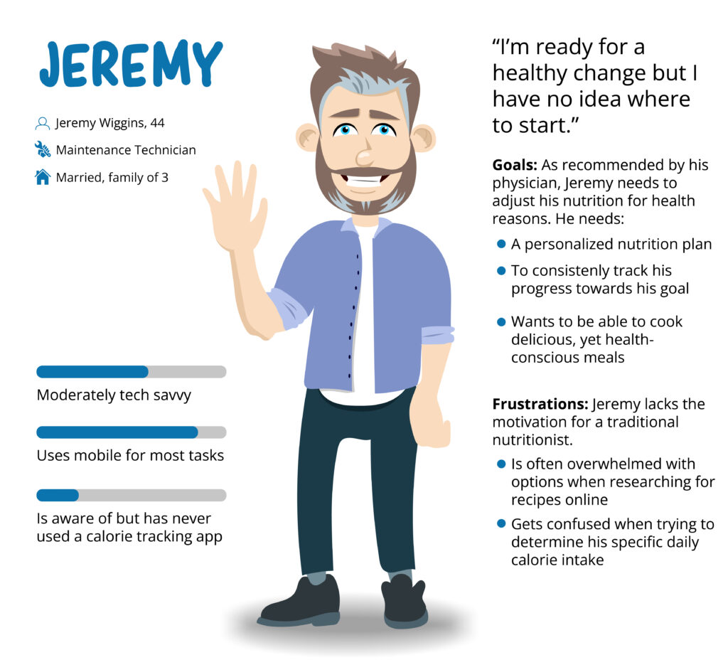
Wireframing and Low-fi Prototyping
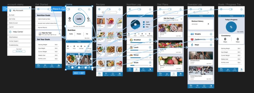
Using Figma for the mobile app design, I created a low-fidelity prototype to establish the user flow. The idea is for users to be able to quickly find each resource/feature that they need to get started. I wanted to take the stress away by having fewer options and simplified design to create an overall enjoyable experience for each user. Whether tracking calories, goal progress or looking for general diet plan suggestions and information, the goal of this design iteration was to make everything readily available and easy to navigate.

Usability Study
I put together a moderated usability study consisting of friends and family with diverse backgrounds, directing them to complete a few specific tasks using the low-fi prototype. The main findings showed that the design needed to be modified to add clarity.

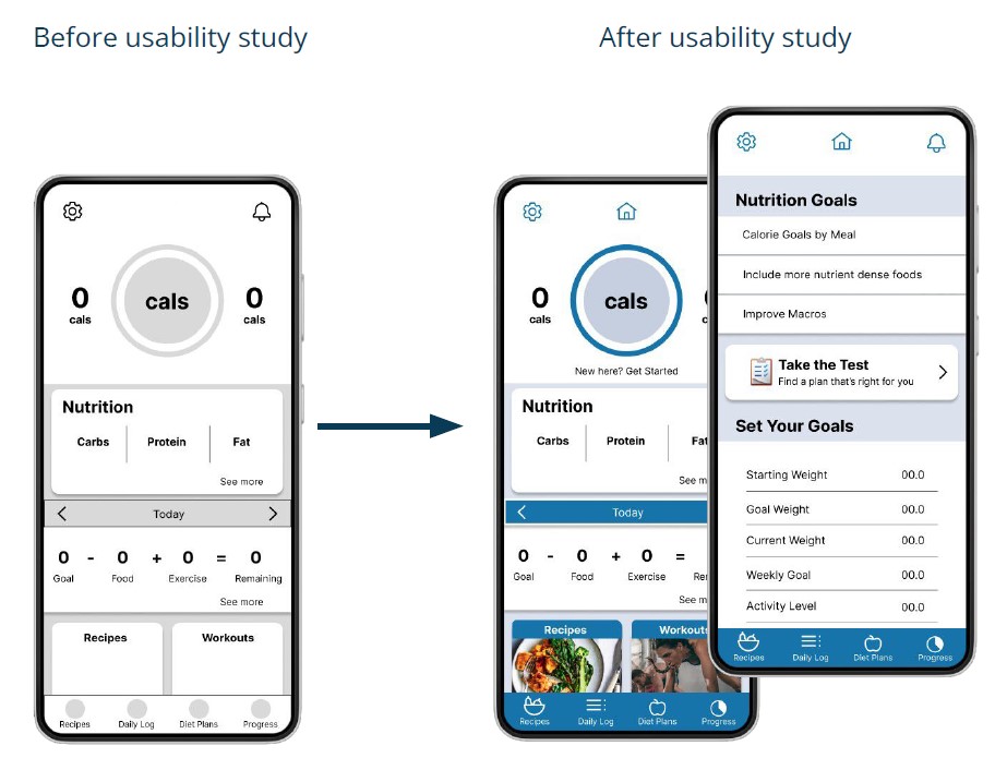
The Product
After conducting a moderated usability study to gather input from several users to identify pain points in the low-fidelity prototype, I assessed the data and created mockups that addressed the key issues and suggestions from the study. The resulting mockups with the additional connecting points allowed users to get around more easily in the app.
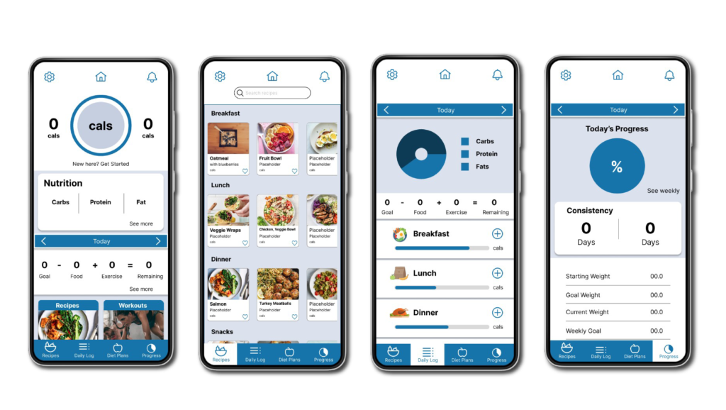
Responsive Web Design
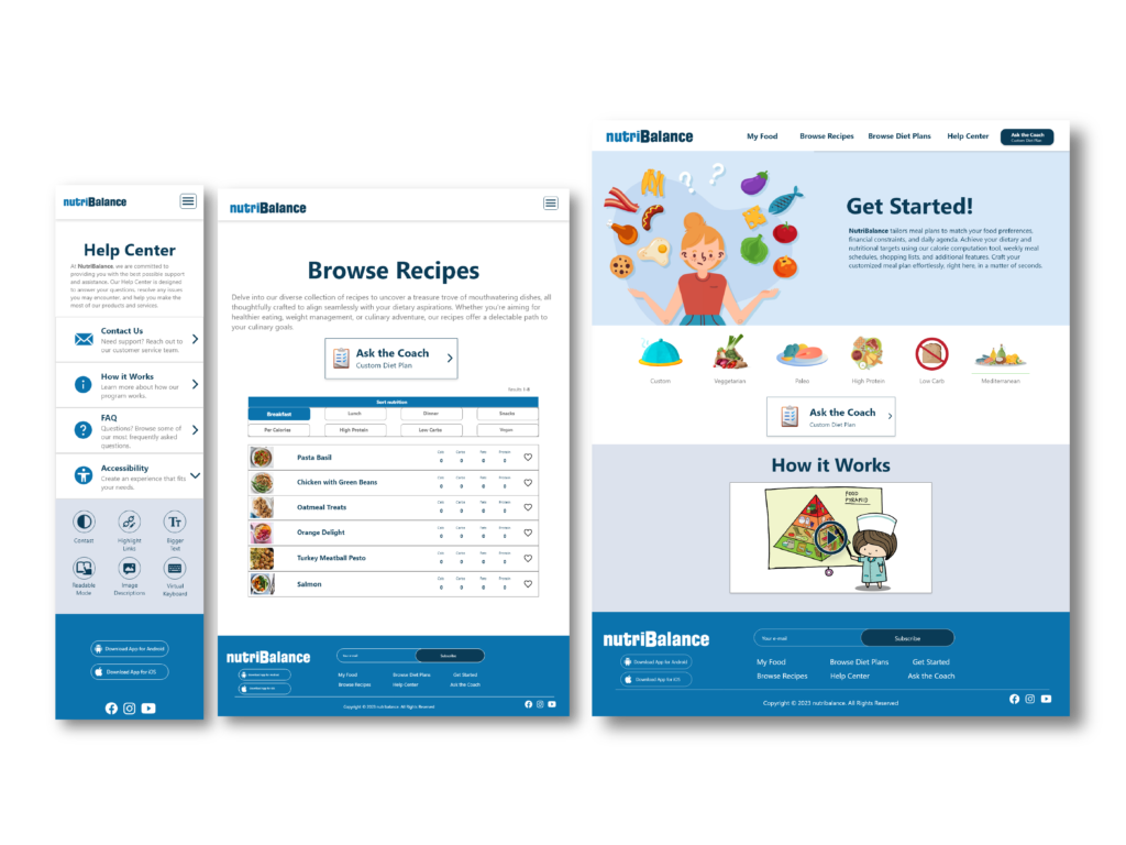
Once the app was fully designed, I began working on a responsive website that included screen sizes for mobile, tablet and desktop. Starting with a sitemap and some rough sketches, I designed the website with the intention of being an informational resource that can further enhance the experience of the app. The cohesive relationship between the app and website is to offer a personalized experience, such as in the app, while have a resource of nutritional information within close range for additional insight.
Future Considerations
Add more recipe options
Further design developent
Animate icons/features
Thank you!