The food truck app is a food ordering app for a fictional food truck company that is centrally located in the heart of Phoenix, Arizona. Normally serving customers in the immediate surrounding area, the food truck needed a way to extend their business by offering delivery. Wanting to internalize the process, I designed a food app that works, functionally, like existing third-party ordering apps but with the food truck company’s personal branding, for a more “mom-and-pop,” small-business representation.
Background
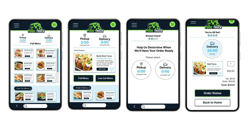
As part of our introduction to UX Design, we were tasked with creating a mobile app for the first project of Google’s UX Design Certification Program. I liked the idea of creating a food ordering app but I wanted it to be as if it were designed specifically for a local, small-business food truck service with the idea that this could be used to expand their operations. Focusing on the customer/the app user experience, I made transparency a high priority, presenting a delivery and pickup timeframe that populates with an estimation of how long the food prep + delivery would take, prior to the order being placed. I kept the process short and easy-to-follow by incorporating visual cues, allowing users to steer off-course, if necessary. The mobile app includes a “my account/login” option and “order history” section for a personalized experience.
Project Duration
To keep up with the timeframe of the Google UX Design Program, I completed the design process including tasks pertaining to research, defining, ideation, prototyping and testing, within the four weeks that we were given. This included going back in and making design changes based off of user feedback and testing.
The Problem
This fictious food truck company wants to expand their business by offering their product to a larger range of people. They have decided to offer delivery as an option for people who are not within range of their physical location, centrally located in downtown Phoenix, AZ. Not wanting to pay the fees associated with partnering with third-party delivery services and wanting to keep the company family-owned and operated, they would like to internalize the delivery process by employing family. I designed the mobile app with the brand colors to keep print collateral and digital advertising consistent with their product/company. The problem involved figuring out how to differentiate from third-party services by researching competitor strengths while seeing what areas could be improved upon. This way, the company can compete with the plethora of food options available through third-party services and so that potential customers would not be turned away by a bad user experience upon ordering.
The Research
For this app, I created a few interview questions to ask what people around me thought about using food ordering apps to have food delivered to their doorstep. After asking about 12-15 people to get a general consensus, I was able to gain insights into the minds of people who have experience using these types of apps. For further consideration, I read through a few of the comments that users were leaving on popular food ordering apps. I’ve added a few examples of pain points to demonstrate the average comment that I received from both personally interviewing people and what I found on competitor apps.
“My order arrived an hour and a half after it was placed. I would like to be compensated for the delay.”
“I would use an app to order food more often if there were more places that included caloric information for menu items. I eat mostly nutritional-dense food throughout the week. “
“I received the wrong order…again. I have used other apps but for some reason, this seems to keep happening on this app.”
“I typically pickup food for myself and my colleagues so I often order a lot at once. I tend to check the bag before I leave to make sure that everything is in there. I would need to be able to be confident that I’m getting all of our food before using a food delivery app. “
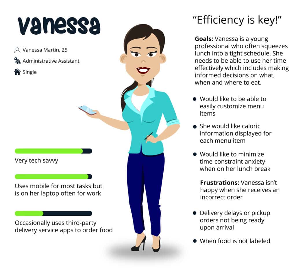
The Persona
Wireframing and Low-fi Prototyping
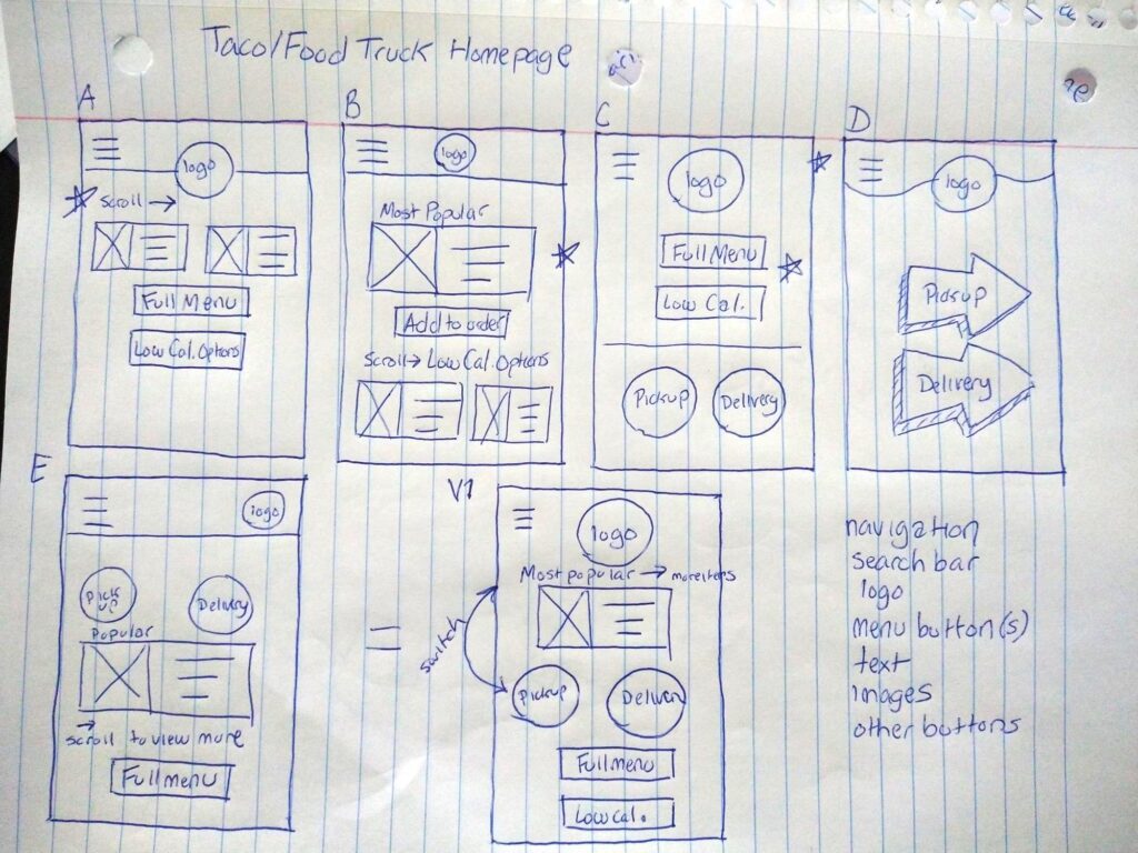
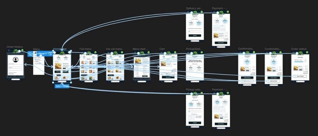
I was able to quickly ideate by creating paper wireframes before jumping into creating digital wireframes in Figma. This gave me an idea as to where to start and how I wanted to arrange elements on each page. With this rough draft as reference, I started with the homepage screen to create a digital wireframe. I created a layout that aligned with the user flow that I had envisioned. This would later help me include potential solutions to some of the pain point issues that had I learned about earlier in the design process. I would further address these in the low-fidelity prototype.
Usability Study
The initial usability study that I put together for users to test the low-fidelity prototype, identified a few areas that needed improvement.
Users wanted more accessible navigation
Users asked for the ability to track their order
Needed to include an area for user’s to input their address to help determine a time estimation for their order, prior to completing the purchase.
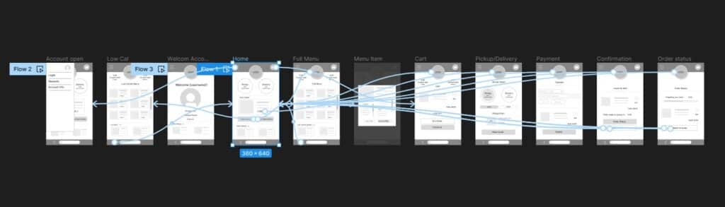
For the high-fidelity prototype usability testing, I needed a way to show users how the order/time estimate would function so I added additional screens to the user flow to help demonstrate this.
The Product
The high-fidelity prototype addressed the user recommendations and concerns. When presenting this to users for the second and final round of usability testing, the general consensus showed that it was clear that users were now able to have a better understanding of how the order duration functionality would work live, and all 6 participants were able to complete the user flow.